
SAMPLE WARRIOR
UI Design For Plugins
Methods
Competitive Audit
Contextual Inquiry
Remote Survey
Kano Analysis
Affinity Diagramming
Wireframing
Think-aloud Protocol
Overview
This project showcases my design and research process for creating user interfaces. From a simple idea to a high fidelity, interactive prototype deliverable, this page highlights my approach to research and testing, visual design, project scoping and management as well as creating deliverable presentations and slide decks for stakeholders.
Role
Product Designer
UX Researcher
UI Designer
Project Manager
Illustrator
Tools
Figma
Figjam
Google Suite
Aesprite
Adobe Suite
Keynote
What is Sample Warrior?
Sample Warrior is a User Interface Prototype for a sampling plugin. It is designed to be a 3rd party product that would be compatible with software platforms used by music producers called Digital Audio Workstations or DAW’s for short.
Sample Warrior’s functionality is entirely focused on the practice of sampling, allowing users to quickly import, chop, edit and control the playback of audio samples, and add some basic effects.
Terminology
Plugins
a plug-in is a software component that adds a specific feature to an existing computer program. When a program supports plug-ins, it enables customization. An audio plug-in, is a plug-in that can add or enhance audio-related functionality in a computer program. Such functionality may include digital signal processing or sound synthesis.*
DAW (Digital Audio Workstation)
A digital audio workstation is an application software used for recording, editing and producing audio files. The top four DAW’s are ProTools, Ableton Live, Logic and FL Studio. They are used almost universally among music producers. Most 3rd party plugins are compatible with all four of these programs.
Sampling
In sound and music, sampling is the reuse of a portion of a sound recording in another recording. Samples may comprise elements such as rhythm, melody, speech, sound effects, or longer portions of music, and may be layered, equalized, sped up or slowed down, repitched, looped, or otherwise manipulated.*
MIDI (Musical Instrument Digital Interface)
MIDI is an electrical communication protocol, that connects a wide variety of electronic musical instruments, computers, and related audio devices for playing, editing, and recording music.*
Defining The Opportunity Space
I set out to design a sampling plugin that would be more intuitive and useful than the competitors on the market. As a music producer myself, I was familiar with the landscape in which these kinds of plugins exist. The concept for this project was born out of a desire to solve frustrations I myself had experienced with this kind of software but I needed to go further. What did other music producers need? Did they experience the same frustrations I did? These types of plugins are so malleable from a design perspective that the possibilities and features I could include were practically endless. I needed to hone in on my specific user group and define a specific opportunity space if I had any hope of creating a successful design.
PHASE ONE RESEARCH
Competitive Audit
Methodology
My research started with a competitive audit. I performed this on nine of the most popular sampling plugins, taking detailed notes on their various features, layouts, and utility focus. This process gave me a thorough picture of the landscape the project would be set in.
Rationale
In FigJam I assembled photos of each competitors UI, price point, links and resources used for reference and my own notes. Most plugins have a plethora of tutorial videos online so my process typically began there, observing the tool in use and taking notes. Then I would go to the products website and do more detailed exploration into their functionality.
Findings
1. I began to see a gap widening in the field between complex, feature-heavy UI and very basic, typically older and hyper-specific UI.
2. I found that many sampling plugins were focused on specific use cases (e.g. drum sampling, cinematic sample libraries, synthesizer hybrids, etc.)
3. Aesthetically, many of the plugins on the Market appeared to make almost all features available on the main screen rather than separating them between pages, frequently resulting in cluttered, overwhelming design.
4. Many plugins heavily emphasize new and unique sample sorting systems in the form of integrated libraries. Some were even exclusively created as a way to sort users’ samples.
Contextual Inquiry
Methodology
I conducted interviews with four music producers to talk about their work and have them show me their process when it comes to sampling. I conducted these interviews remotely over Zoom, they lasted approx. 45 mins each and covered topics such as sample selection, tools they use, what they like about their process, common pain points, and needs/desires.
Rationale
I chose to do contextual inquiries because I knew that my users would have a wide variety of workflows and methods. I wanted to ensure I took a broad look at their process as a whole, focusing not so much on the particular tools they use but more on the tasks they commonly need to perform.
User Quotes
“I hate plugins that have more than their function.”
“If I were buying a sampler and it was marketing itself as a sampler I don’t want a whole bunch of bulls*** unless there’s a reason.”
“I think being able to take a sound and then really fine tune it and get it to sound exactly how you want it to before you record it is really cool.”
“I like when things are right in your face, like just a simple knob.”
“Being able to create keyboards out of random things is unique.”
Findings
My users typically utilize sampling at the beginning of their creative process, saying they are looking for a way to spark creativity and come up with new ideas.
My users have well-established workflows that are incredibly interlinked with the DAW they work in. Any tool that causes a major upset in that workflow is unlikely to be used. They want tools that integrate seamlessly into their workflow.
Users confirmed that there is a “happy middle ground” for them between simplicity and complexity. Too many features and they will get overwhelmed, too few and they will be frustrated that they have to find a second tool to accomplish the task.
I started to gather data from these users about what features would be the most important to them and found that there was a wide variety of opinions depending on their work.
Remote Survey
Methodology
From my contextual inquiry and competitive audit, I knew that the most important thing to figure out would be which features to include in my prototype and which ones to exclude. There were literally hundreds of things I could incorporate in the design. The key question was which ones should I incorporate?
Rationale
To hone in on the desirability and usefulness of certain features I conducted a remote survey. This was sent out to seven participants, all of whom are music producers. The questions on this survey were formatted for a Kano Analysis, allowing me to methodically rank each feature and its importance to the users. Additionally, the survey included some more general questions for participants to answer.
User Quotes
“Workflow and intuitiveness is very important to me when using any plugin.”
“I don’t like having to navigate libraries inside the plugin instead of externally.”
“Since I am looking to create new sounds… having effects would be very useful.”
“If there’s no keyboard mode than the sampler is pretty much useless.”
“Being able to visualize what sections of the audio I’m working with is extremely important for me.”
“I always enjoy plugins more when they look cool…”
Findings
Electronic and Electronic-adjacent genres are the most common types of music my users are making
Sampling is a key process to users with %100 reporting that they use it “constantly” or “pretty often”
Users overwhelmingly want a sampler that will be used to spark creativity and come up with new ideas
Most users already have established methods/channels for finding/sorting their sample libraries and they don’t want this process interfered with.
Users need to be able to visualize the audio they are working with (seeing the waveform is very important)
Users have very mixed opinions when it comes to integrated effects. Some feel strongly in opposing directions.
Synth integration is not very important to most users
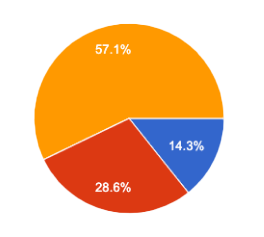
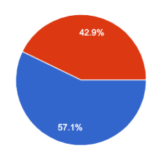
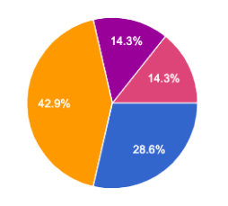
Kano Analysis
Methodology
From the data gathered during my remote survey, I was able to methodically plot each feature on a grid, ranking them on importance and desirability using the Kano analysis method. The further towards the top-right of the chart a feature is, the more important it is to the user. Click on the chart to the right to view the results!
Affinity Diagramming
Methodology
In FigJam, I assembled observations from each research method on sticky notes. To derive useful insights from these individual data points, I sorted through each one, categorizing them into several different groups. I started by collecting comments and observations about particular features, and then grouped the remaining data points into five major findings categories. These five categories were:
Sparking Creativity
UI
General/Misc.
DAW integration
Simplicity vs. Complexity
Key Takeaways: Phase One
User Pain Points
After speaking with many users, these are the four major pain points I knew my prototype would need to address.
Complexity vs. simplicity: users find that existing sampling plugins are often either too complex or too simplistic for their needs
Integration with DAW workflow: users prefer to work directly within their DAW timeline for sampling, but find this process clunky with existing plugins
Creativity spark: users value tools that inspire creativity and help them explore new possibilities
Aesthetic appeal: users are concerned with the appearance of the plugins they use. It’s important to them that they are sleek and visually appealing.
User Value Statements
Phrased as value statements, these are the key takeaways from my overall phase one research process. These are the findings that I used to develop my goal statements.
Users highly value tools that will spark creativity
Users highly value looks and aesthetic design
Users highly value tools that integrate with their DAW-centered workflow
Users value tools that strikes a happy medium between simplicity and complexity
Goals Statements
After conducting my first round of research, synthesizing all the data points, and identifying four problem spaces I was able to craft these two overarching statements to guide my prototype design.
User Goal Statement
I’m a music producer making electronic/electronic adjacent music. I need to be able to easily manipulate audio samples to develop new ideas, within my established workflow.
Product Vision
Sample Warrior will provide a robust yet streamlined sampling workflow. It will spark creativity in users while integrating smoothly with their DAW-centered workflow.
PHASE ONE PROTOTYPE
Creating Solutions
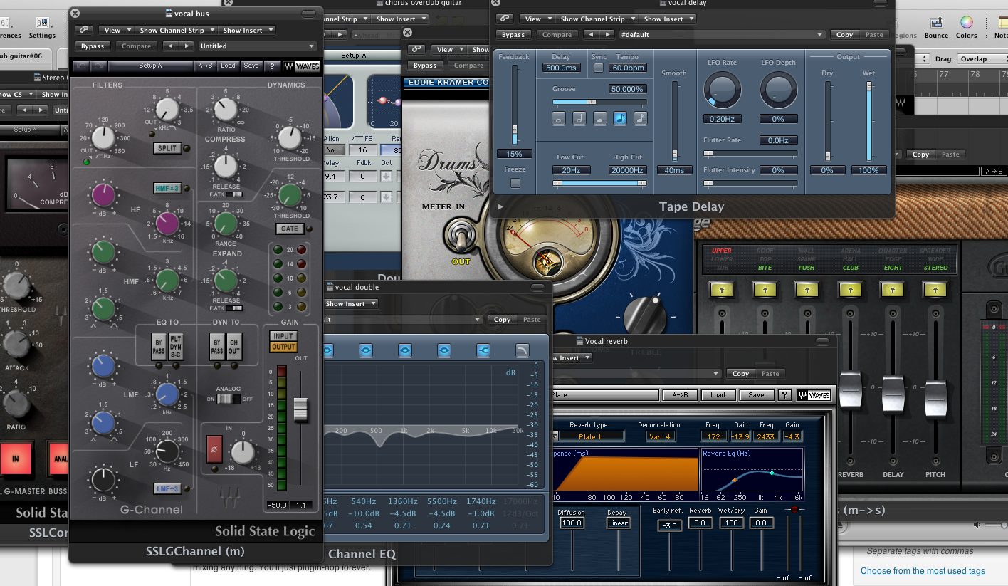
With my initial research complete I set about to create an initial design prototype for my plugin. I began by iterating low fidelity whiteboard sketches until I was satisfied with the design. Then I opened Figma and began working for real.
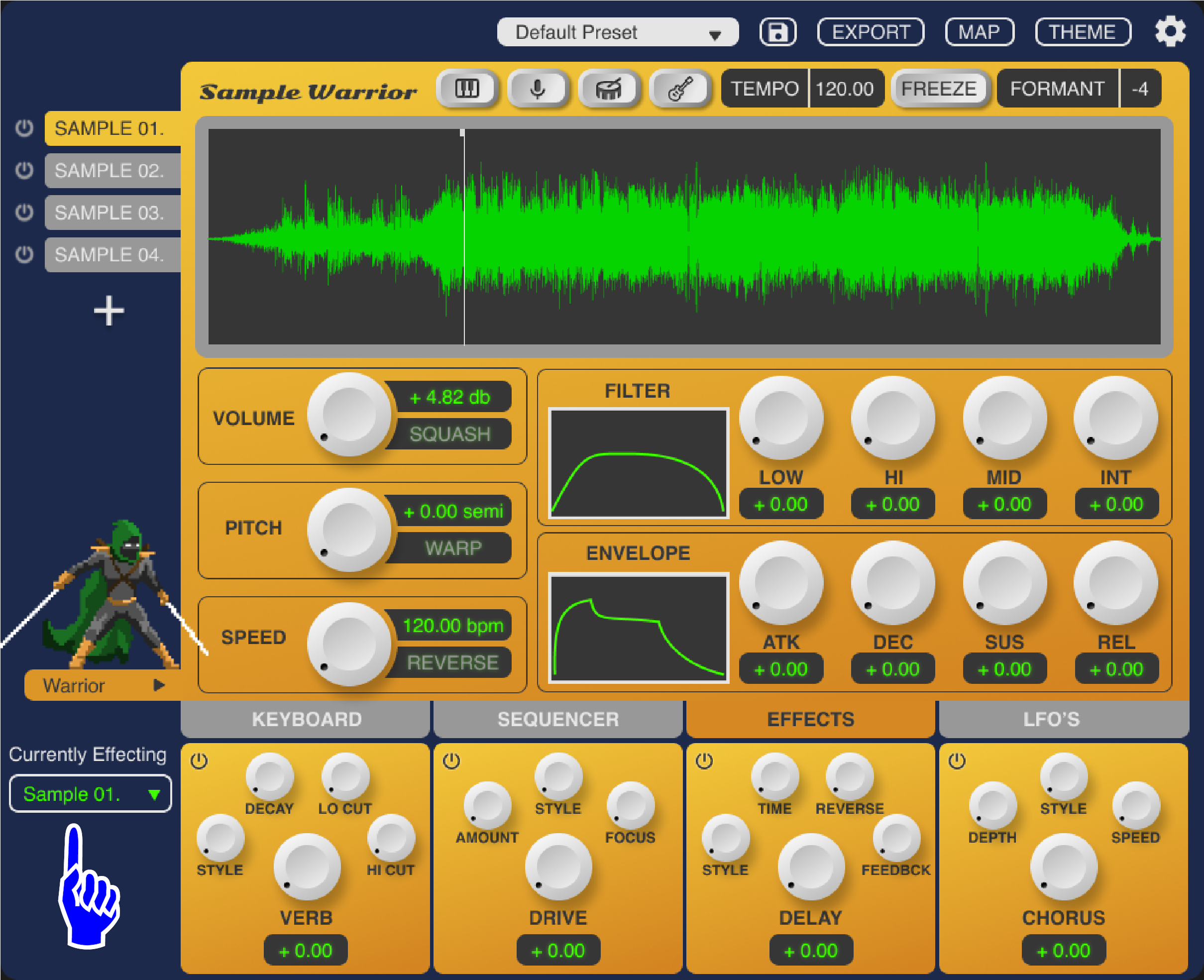
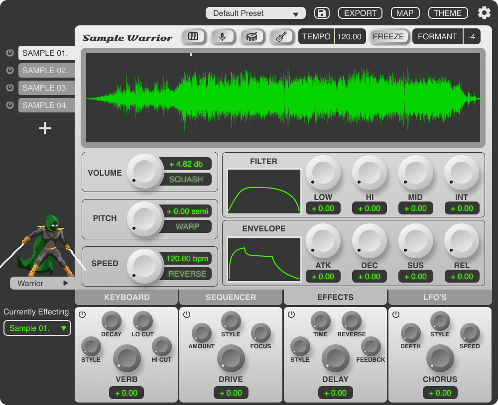
Phase One Prototype Annotations
Click through the images below to read highlights and rationale behind the first round of designs!
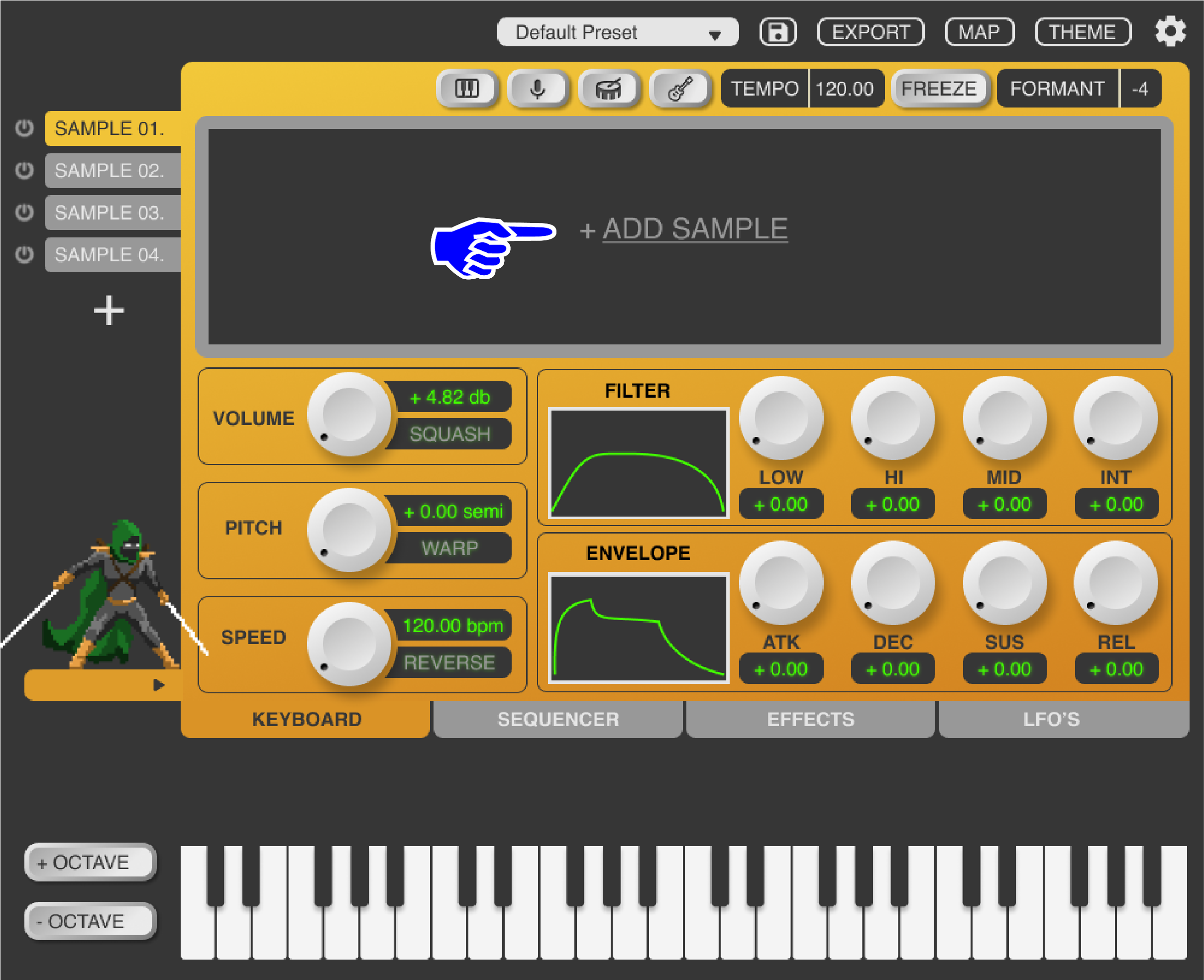
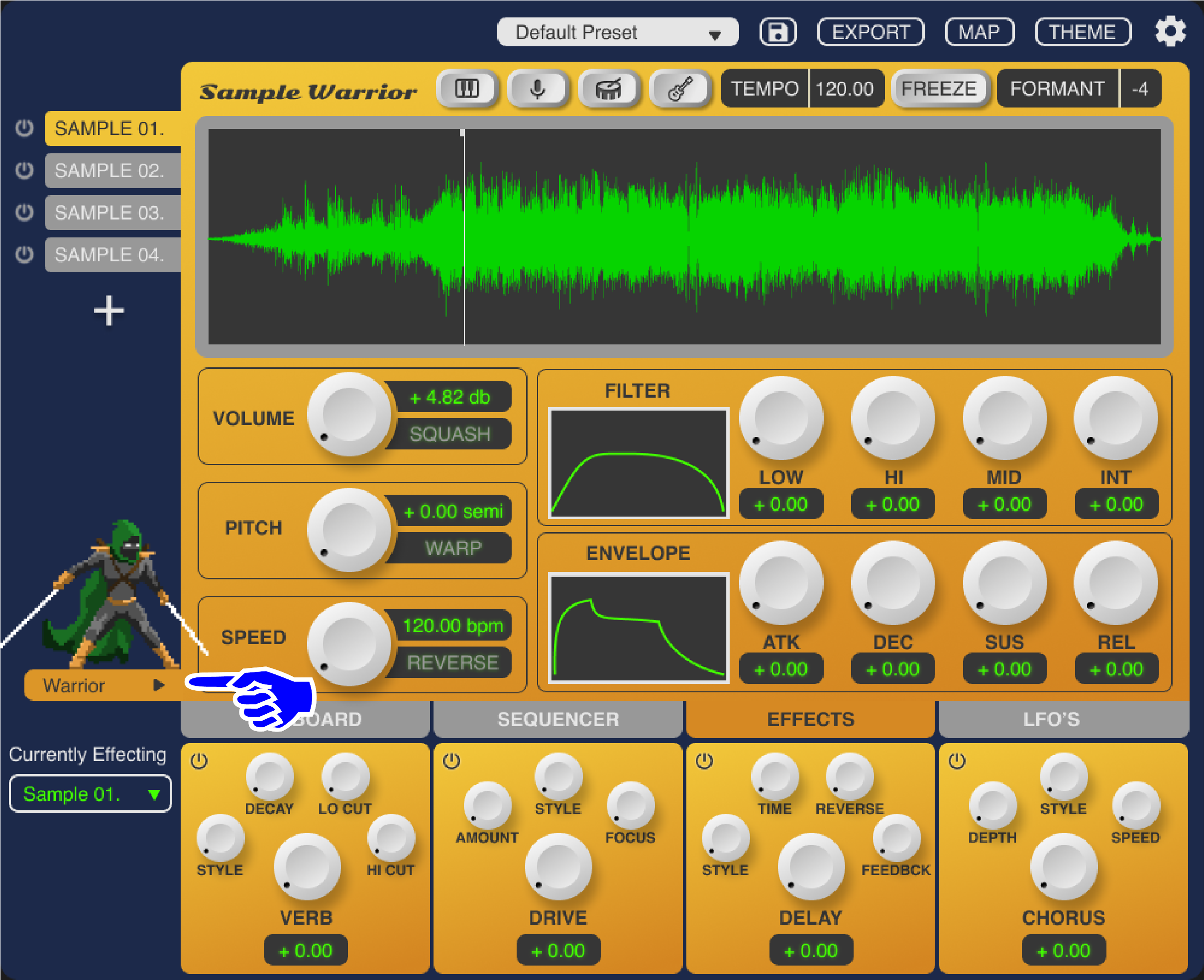
Sample importing is integrated with users’ native file library so they don’t have to adjust their workflow
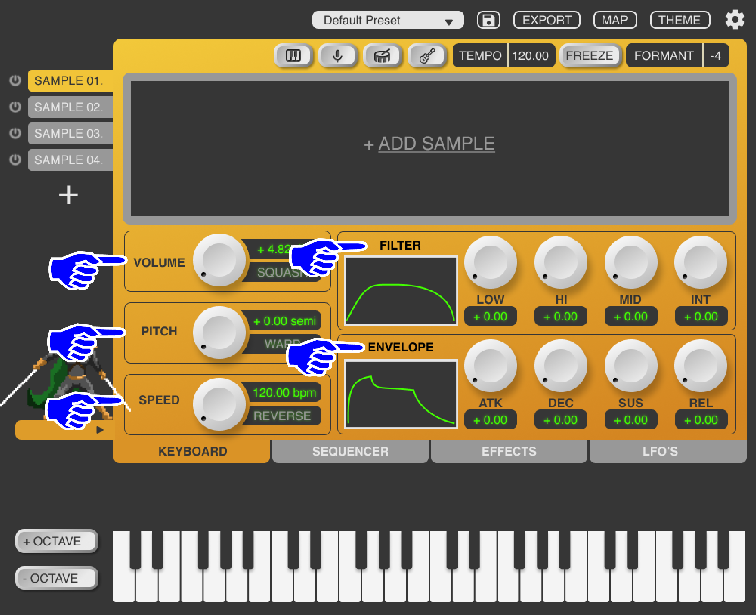
Only the most basic and important controls are prominently displayed on the main screen as big knobs, eliminating unnecessary noise and providing hierarchy to guide the user

The keyboard display is by far the most important and most commonly used control method for users. As such it is the default tab selected upon launch.
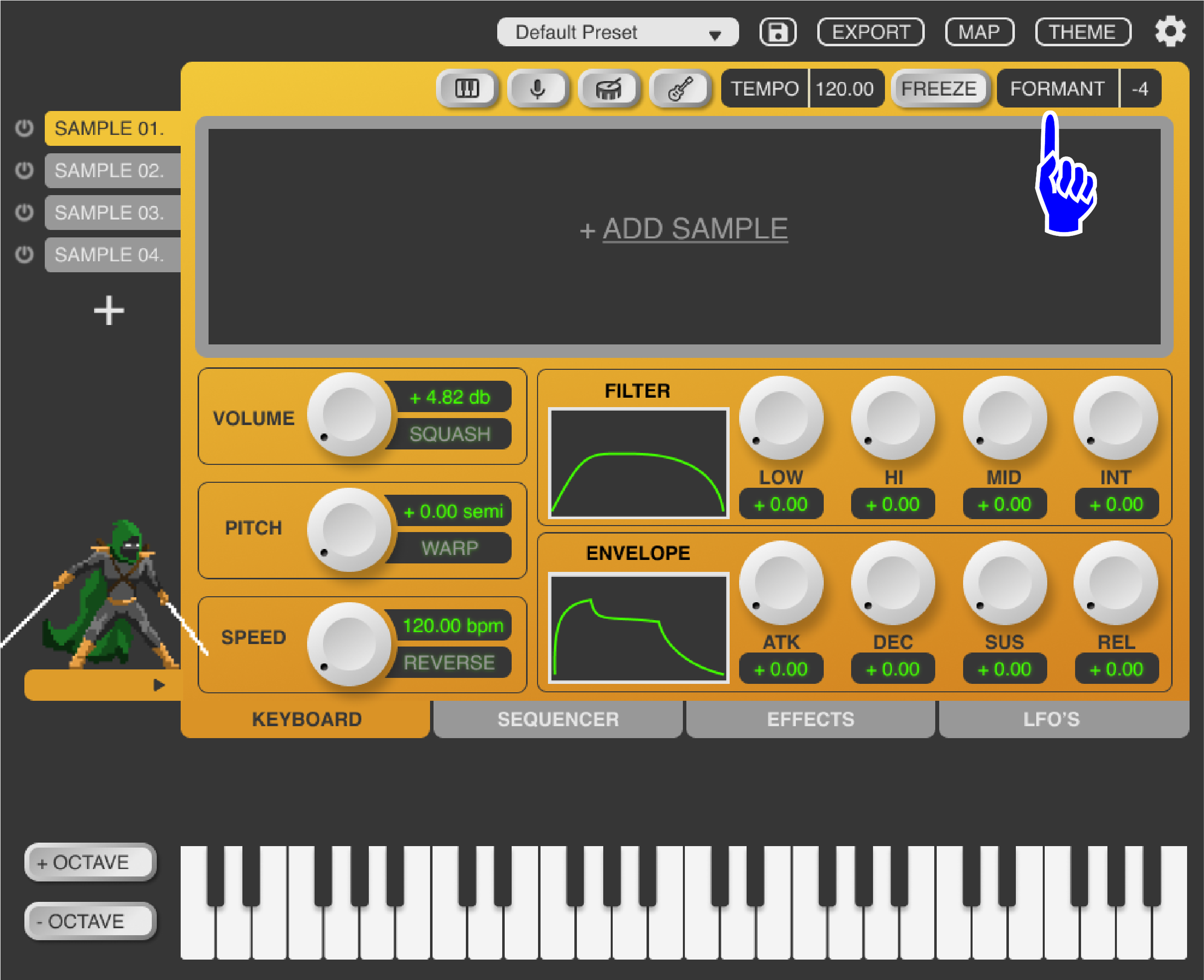
The formant controls are a highly requested feature from users. It gives them control over the tonality of a sound without changing its pitch.

The “Squash” button takes one of the lowest requested features, a compressor, and turns it into a unique and creative element. Rather than including an entire compressor with all its parameters and complexity, this button simply toggles on or off a super-powerful compressor that distorts and reshapes the sound of the sample in a more interesting way, encouraging users to experiment and try new things all while remaining unobtrusive and avoiding feature overload.
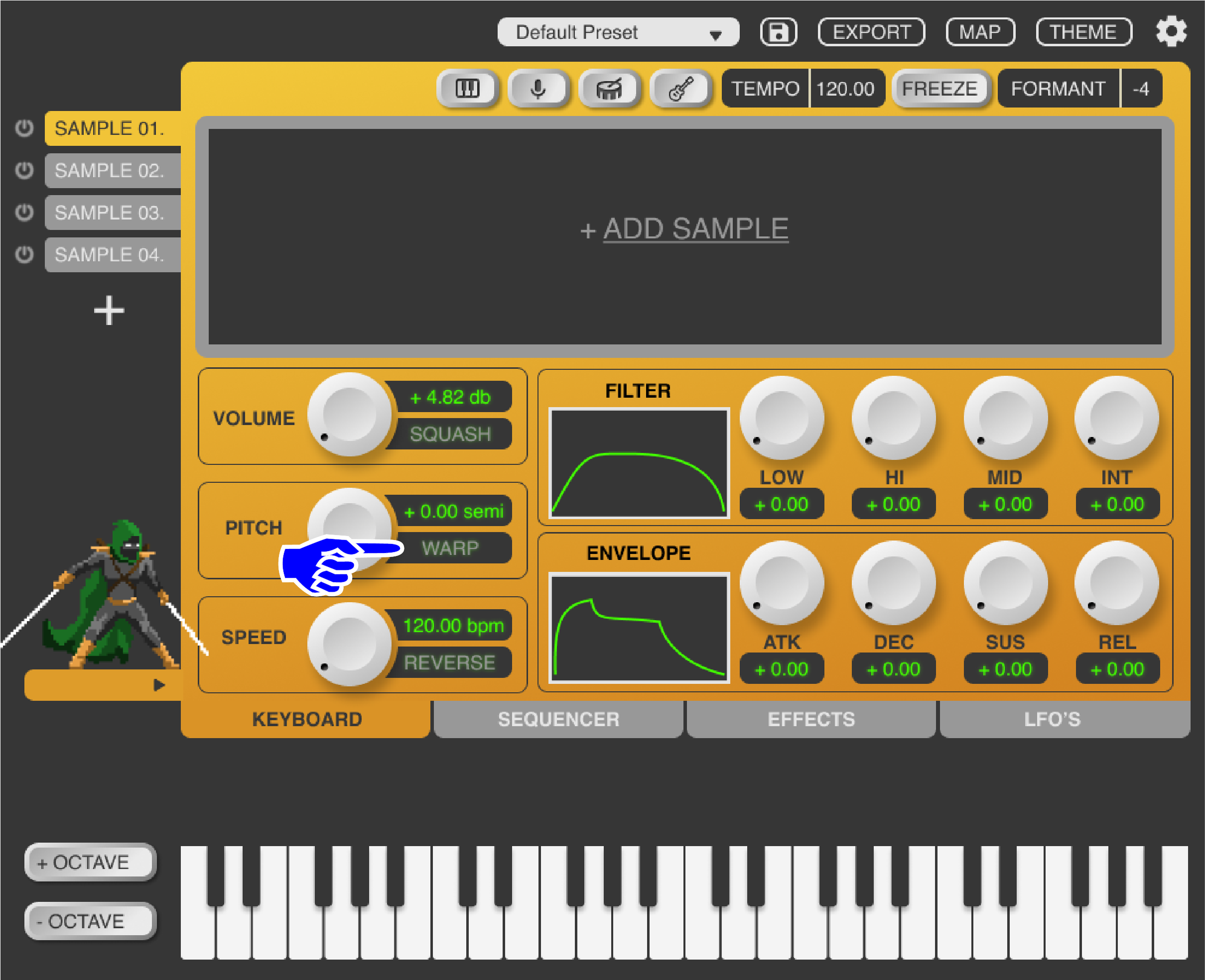
The warp button allows users the ability to re-pitch a sample without changing its speed.
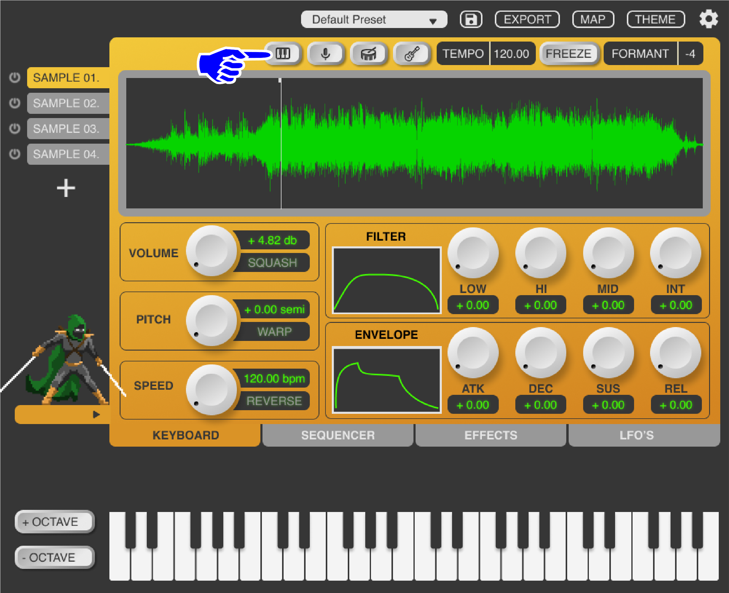
Sample Warrior utilizes cutting-edge AI isolation technology, allowing users to easily isolate individual sounds from full instrumentals. This will broaden their sound palette immensely and aims to help spark creativity in users.
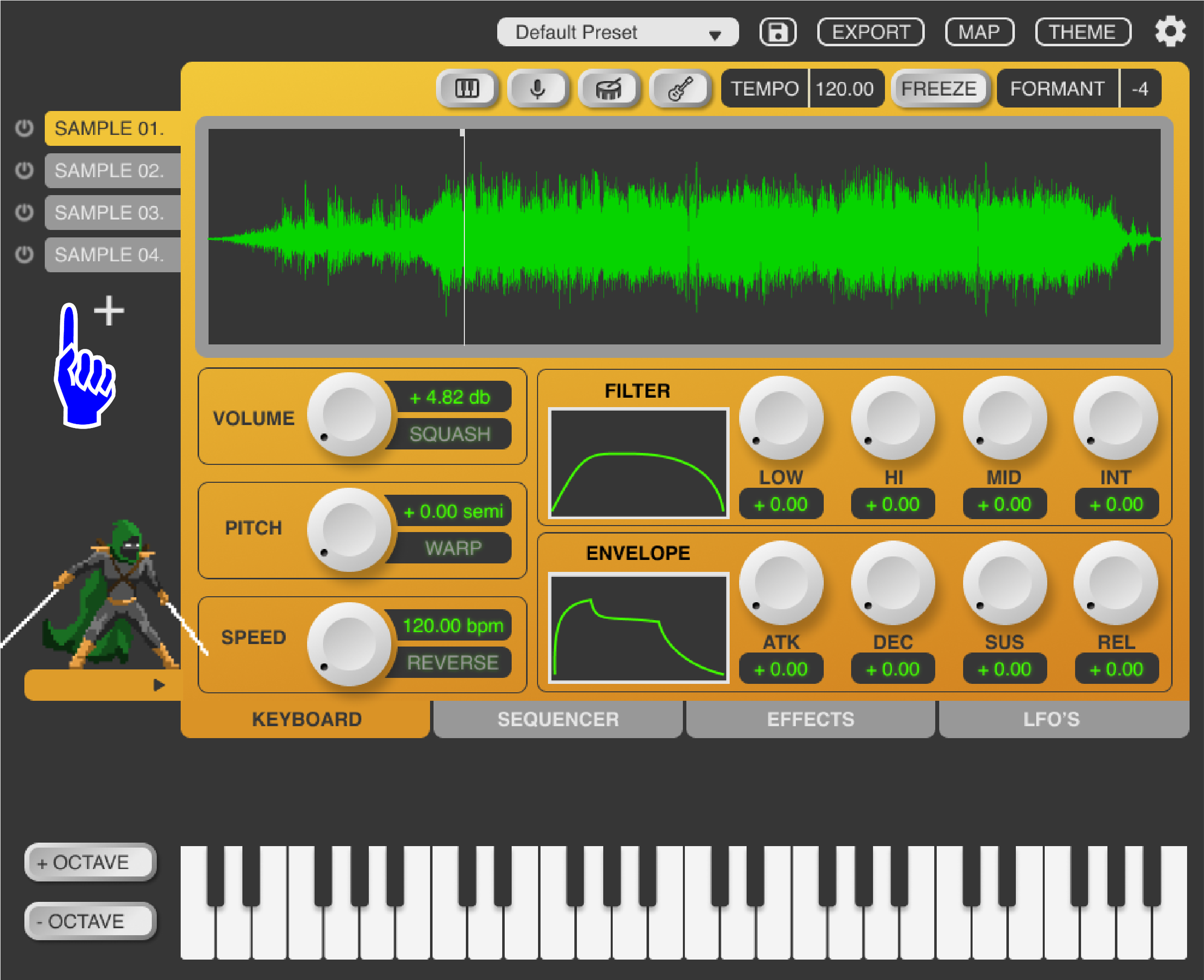
The multi-sampling menu is discrete yet clearly displayed, keeping users workflow quick and efficient.

The character animation can be opened or closed depending on a user’s preference, allowing them to customize the aesthetic of the plugin.
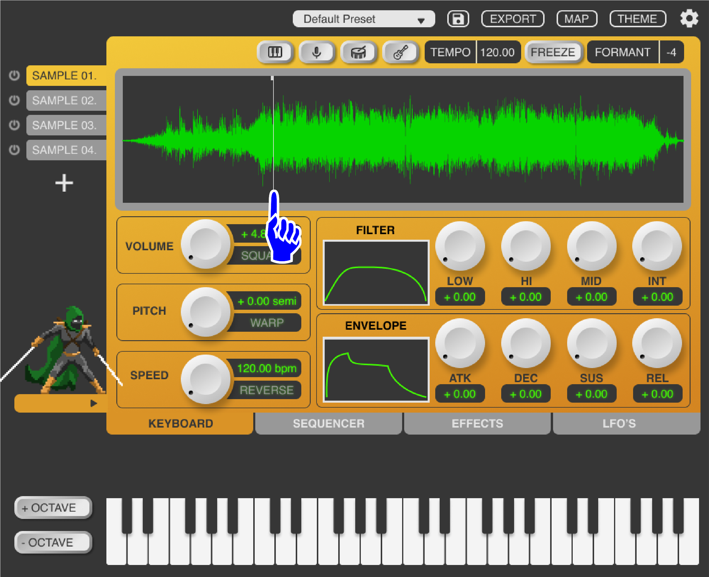
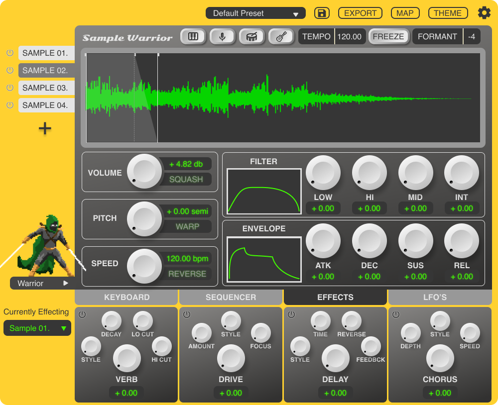
The audio waveform is prominently displayed with simple and efficient playhead tabs to control the start/endpoint of sample playback. The waveform is visually responsive to all parameters on the main page. making editing quicker and more intuitive.
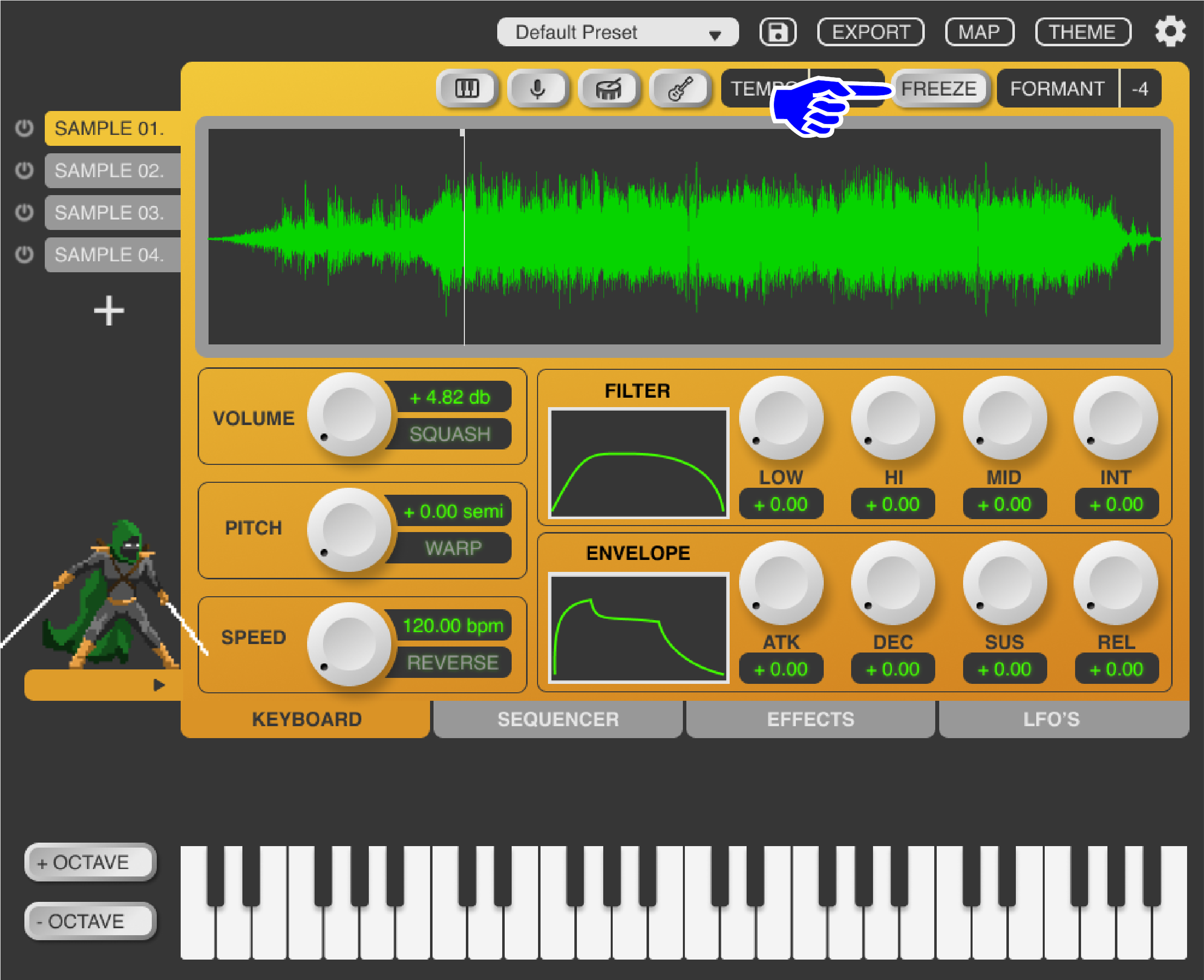
The freeze button infinitely loops playback directly at the playhead, allowing any sound to be transformed into a synthesizer in tandem with the envelopes. This is a unique feature that gives users a ton of flexibility and aims to help generate new ideas.
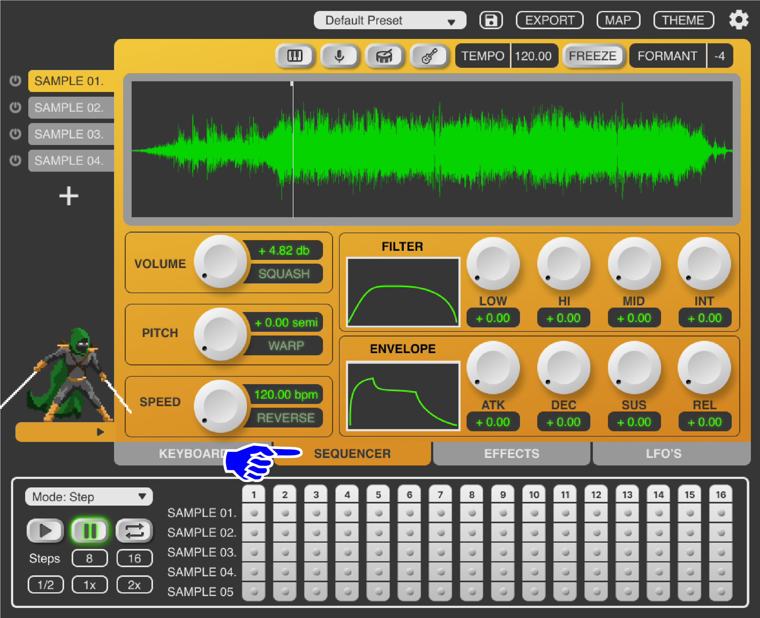
The sequencer view allows users to quickly create drum patterns directly in the plugin, cutting out a time-consuming step in their process. Previously they would have to constantly switch back and forth between the plugin and the DAW timeline.

This display gives real-time visual feedback to users as they create patterns using the multi-sampler, eliminating the need for users to switch views between their DAW and the plugin.
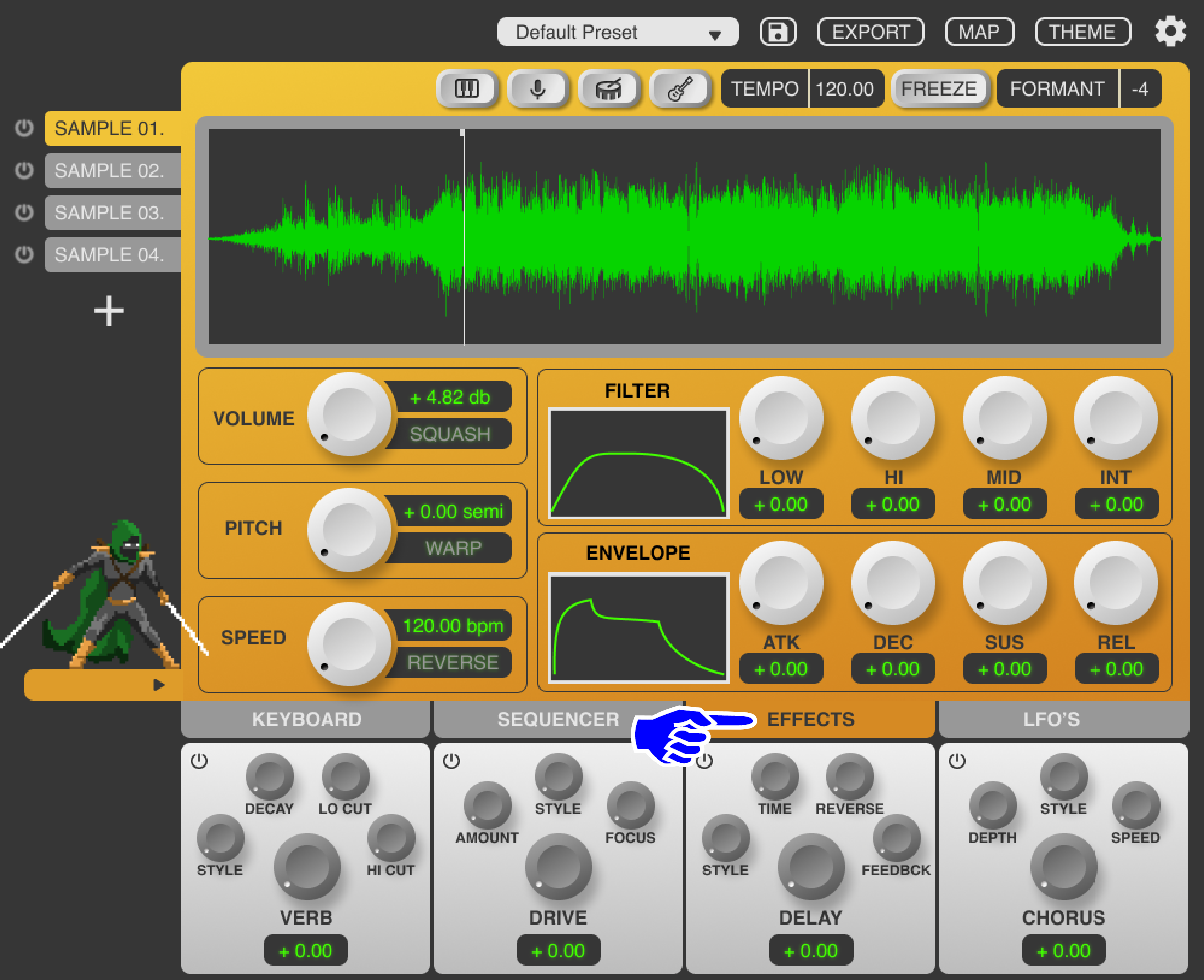
The effects are kept to a minimum and tucked away in the third tab of the footer. Only the top four, as ranked by users in the remote survey, are included. These design choices aim to help streamline users workflow by limiting visual noise and prioritizing only the most important effects.

Likewise, the control parameters within each effect are kept to a minimum with a maximum of four parameters per effect.
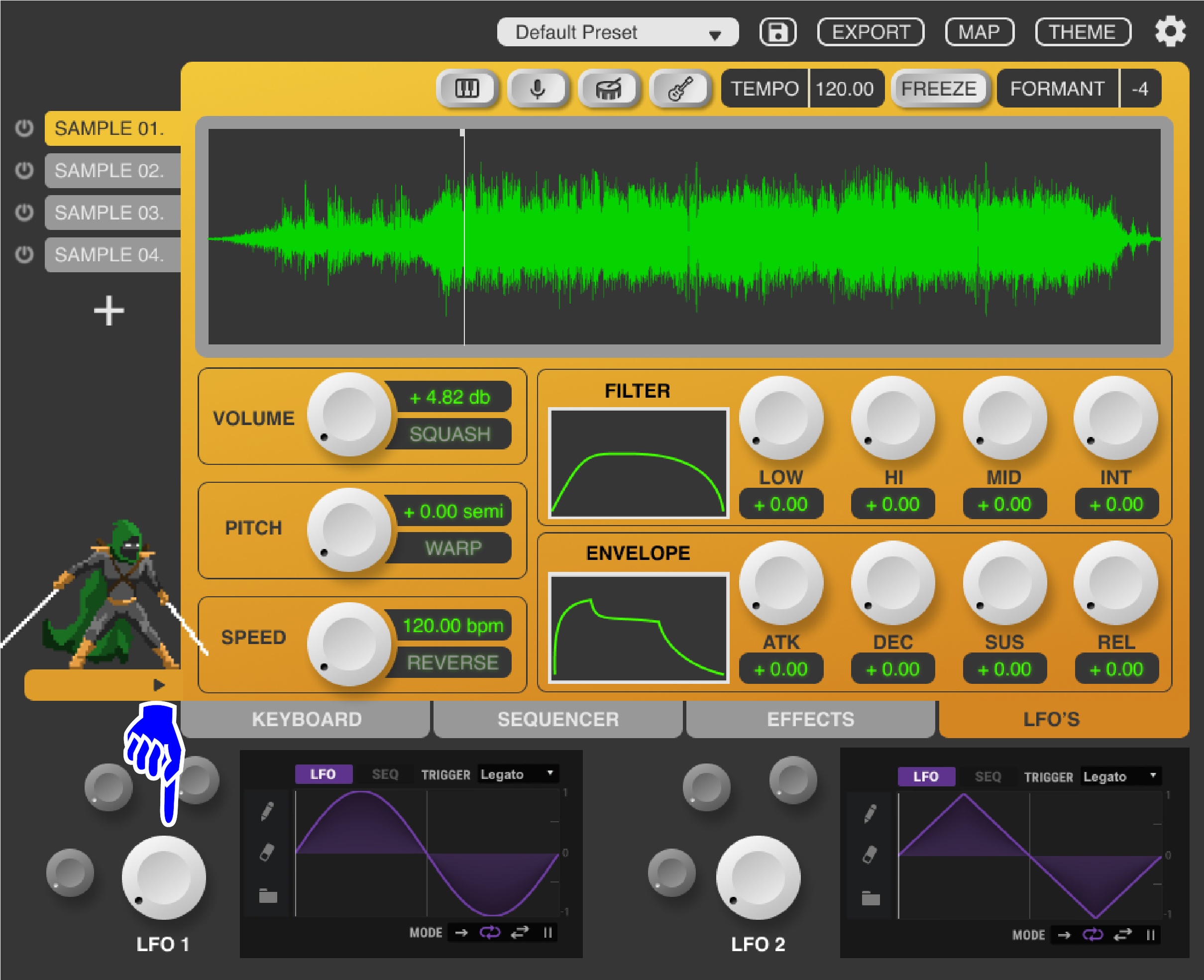
The LFO’s are limited to two and laid out similarly to the effects tab, establishing visual consistency and making the users’ journey through the plugin more intuitive.

The LFO displays are responsive to the audio and give real-time visual feedback for adjustments.
Skeuomorphic knobs and buttons aim to clearly afford their functionality and align with pre-existing mental models from analog music hardware. When activated, these dials emit a faint, colored glow intended to appeal to users aesthetically and enforce visual feedback for ease of use.
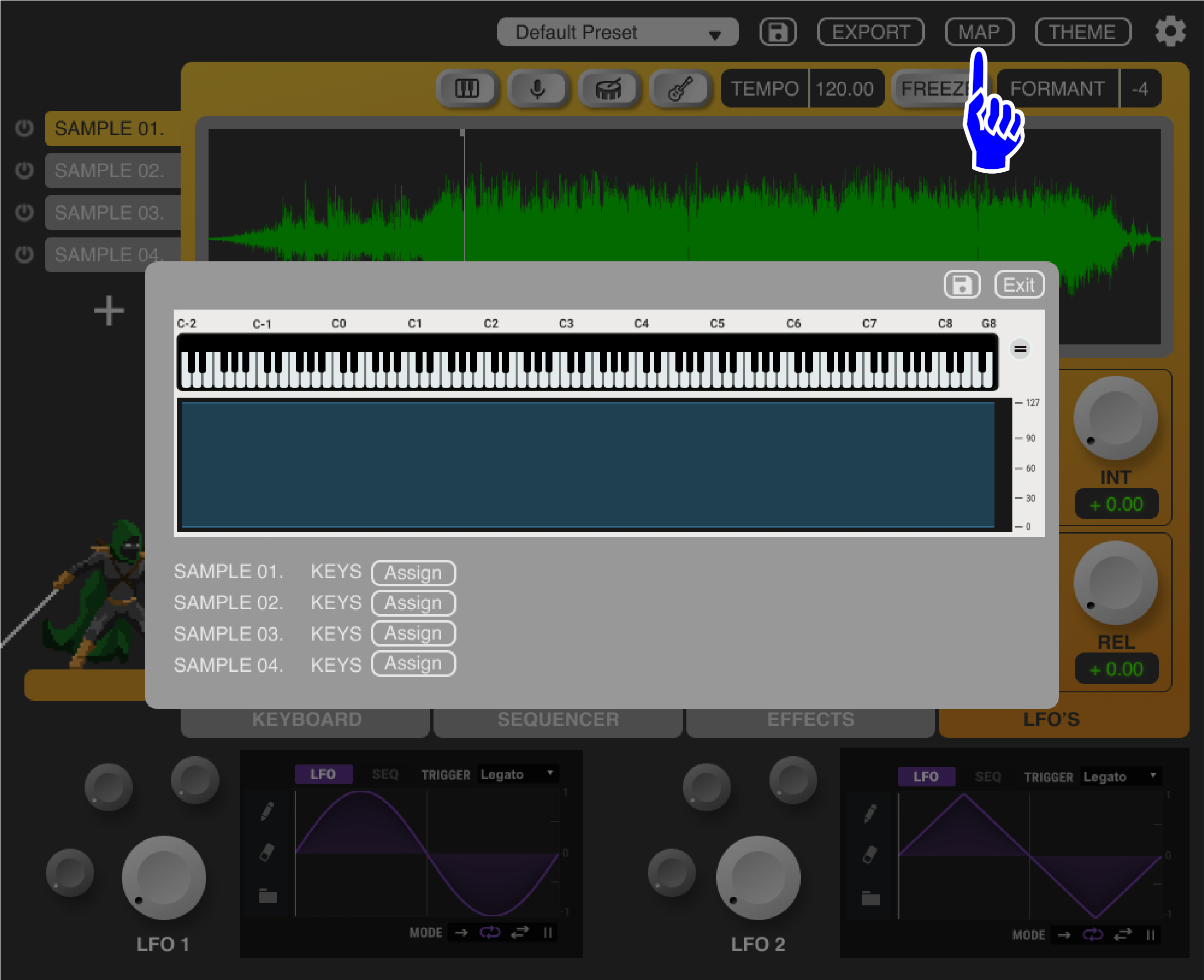
This discrete button opens the “mapping” popup window, which allows individual samples to be mapped to buttons on any MIDI controller connected to the users’ DAW, integrating effortlessly with their current tools.

These buttons allow users to select which sample is being assigned to which MIDI triggers, Ensuring thorough mapping functionality is available.
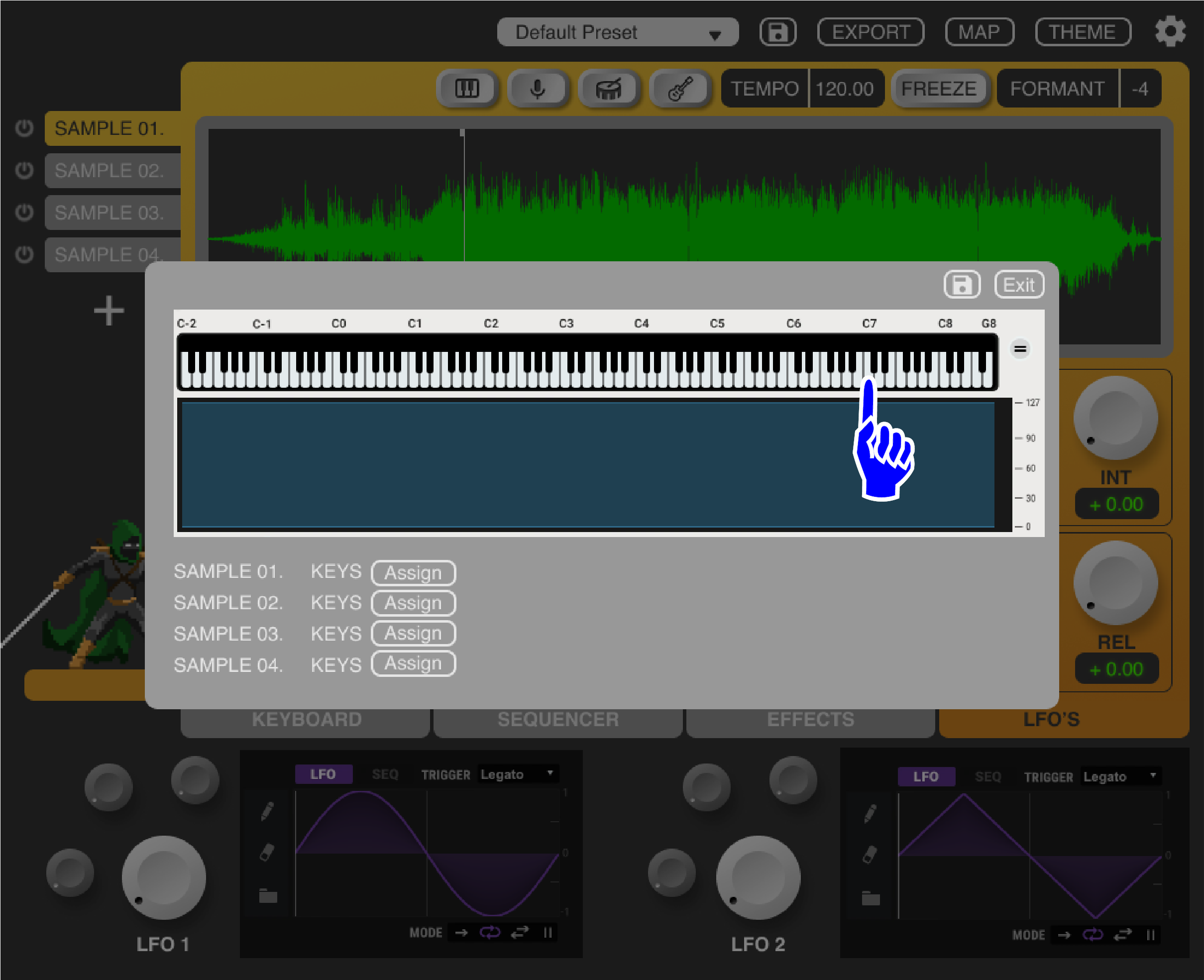
Note: this display would show whatever controller is connected, not necessarily a keyboard, although that is the most commonly used.
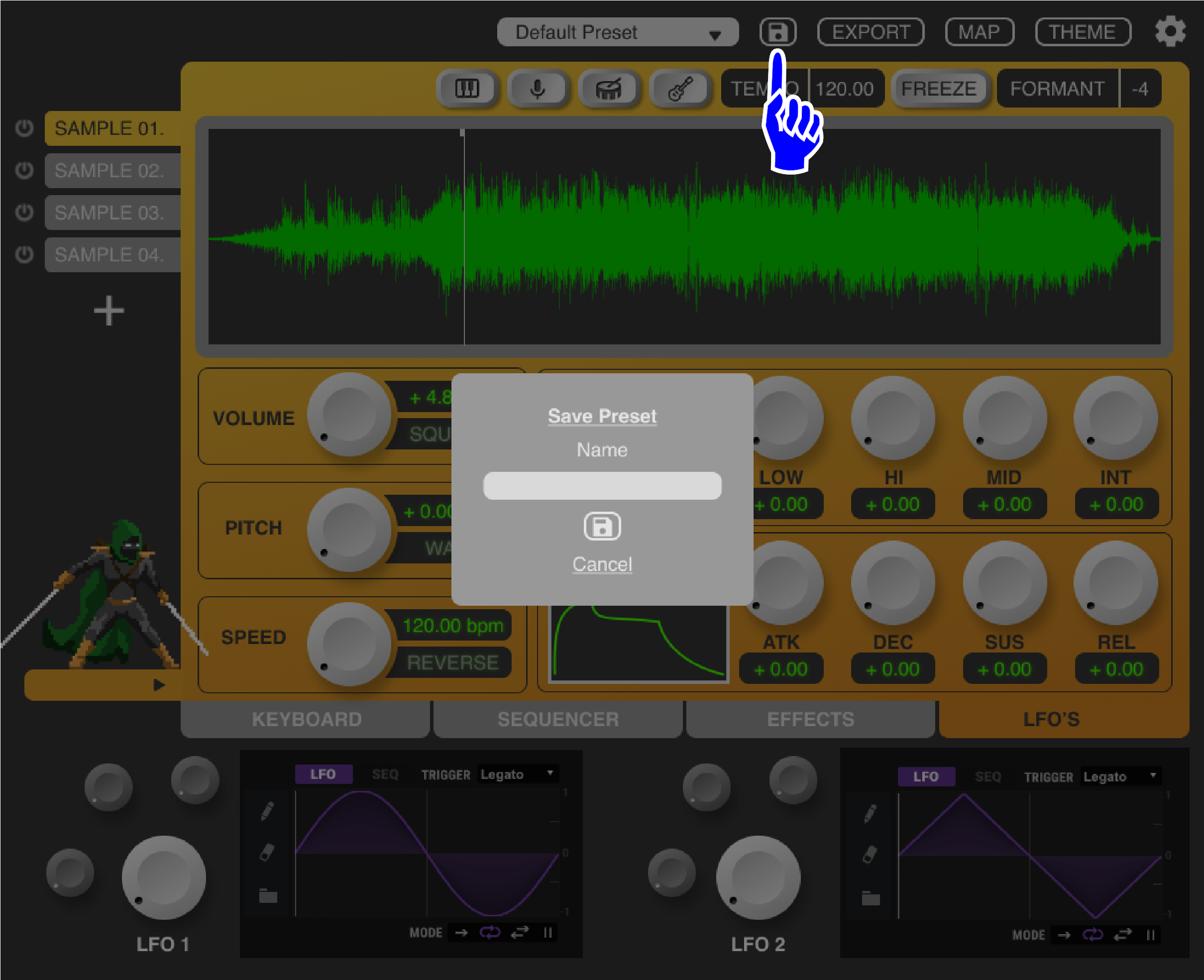
Users can press this button to save presets, allowing them to easily return at any time to instruments they have created or sample sets they use frequently within the plugin. Individual parameter settings will all be saved as well, reducing the amount of time required to activate commonly used soundscapes.
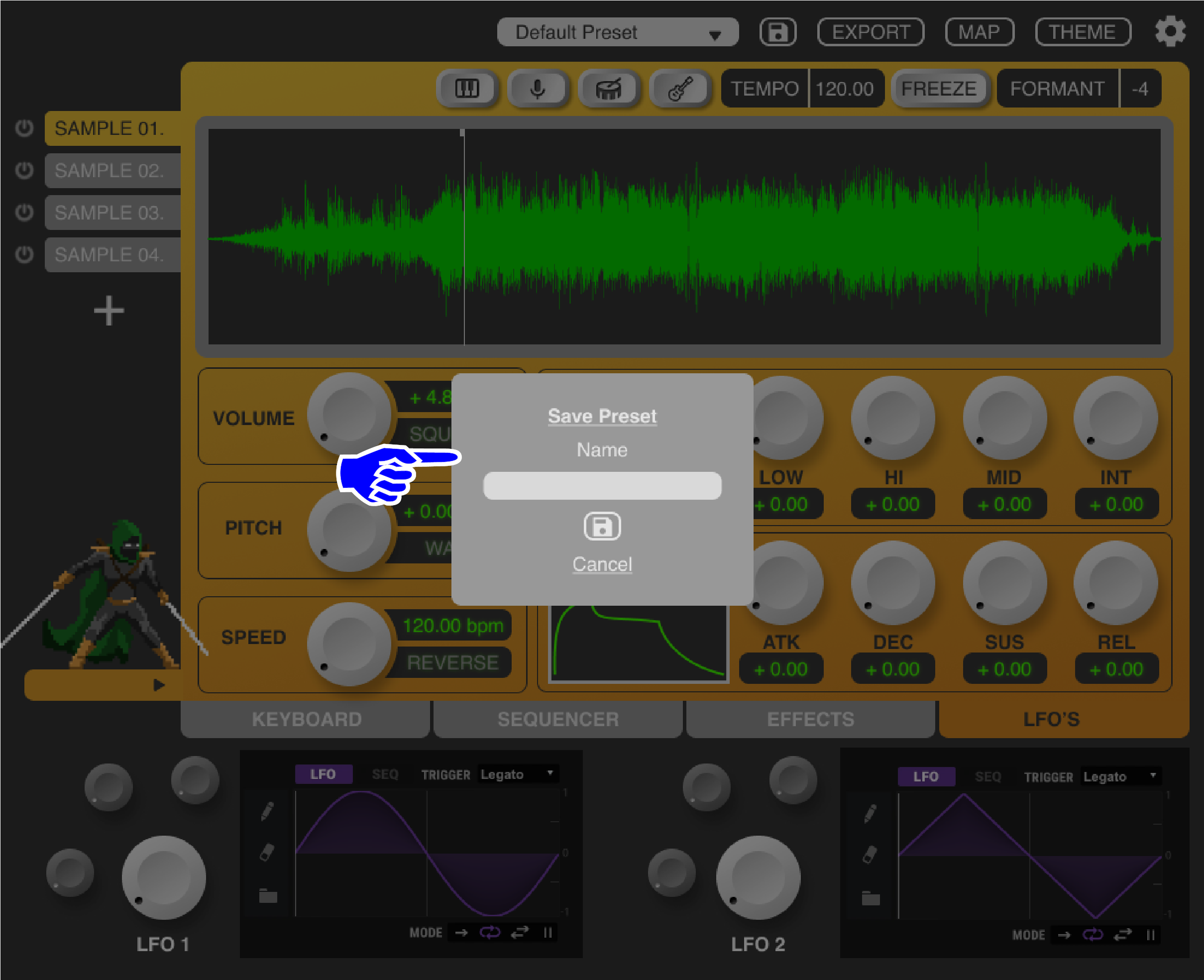
This popup allows users to name their presets.

Users can access their own saved presets via this dropdown menu as well as 3rd party/stock presets and instruments. This gives users lots more options to explore and can save valuable time when they need a quick fix for a project.
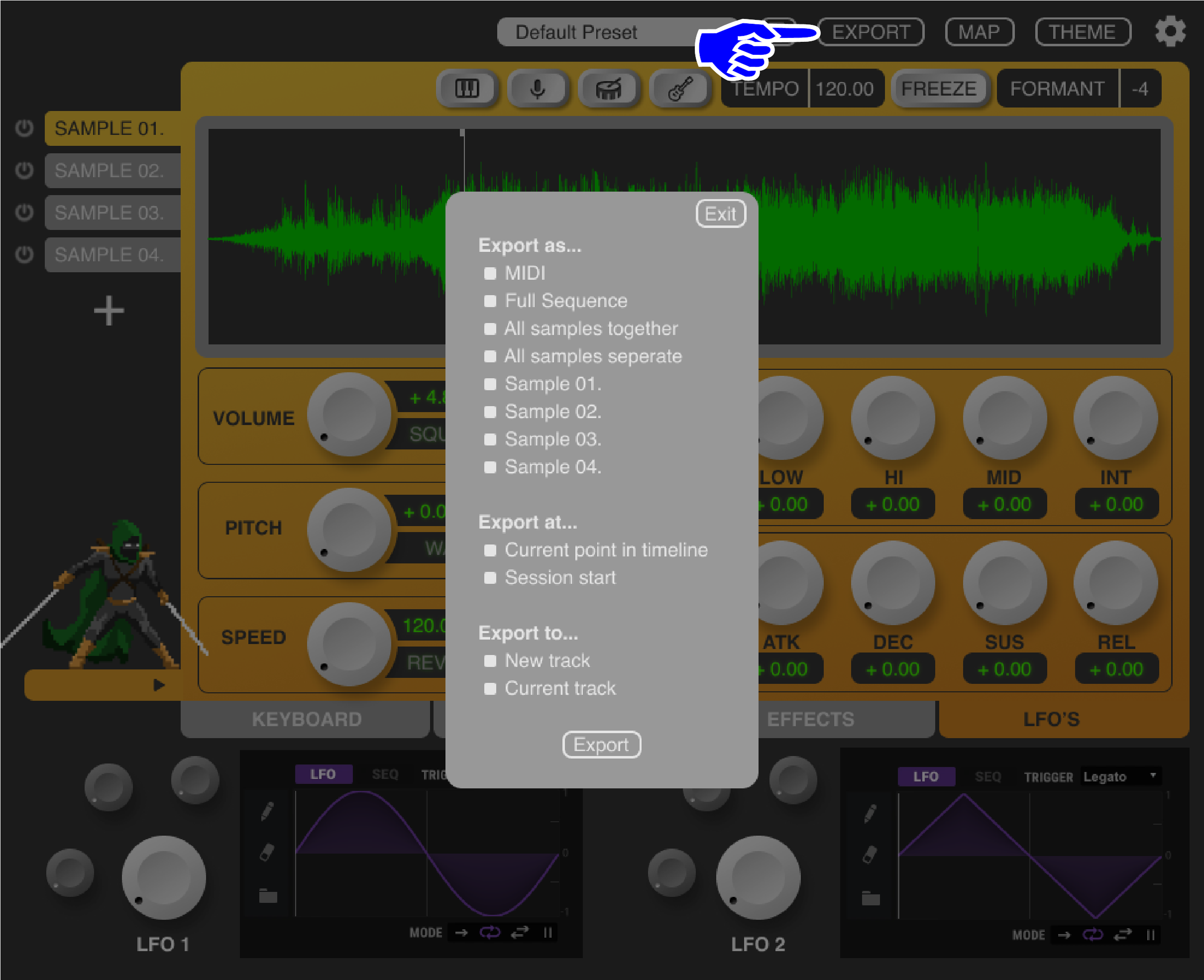
This button opens the “export” pop-up, allowing users to send audio and MIDI data directly back from the plugin into their timeline. Most sampling plugins only function as MIDI controllers, requiring users to manually record audio or MIDI to new tracks, a time-consuming process that this feature would eliminate.
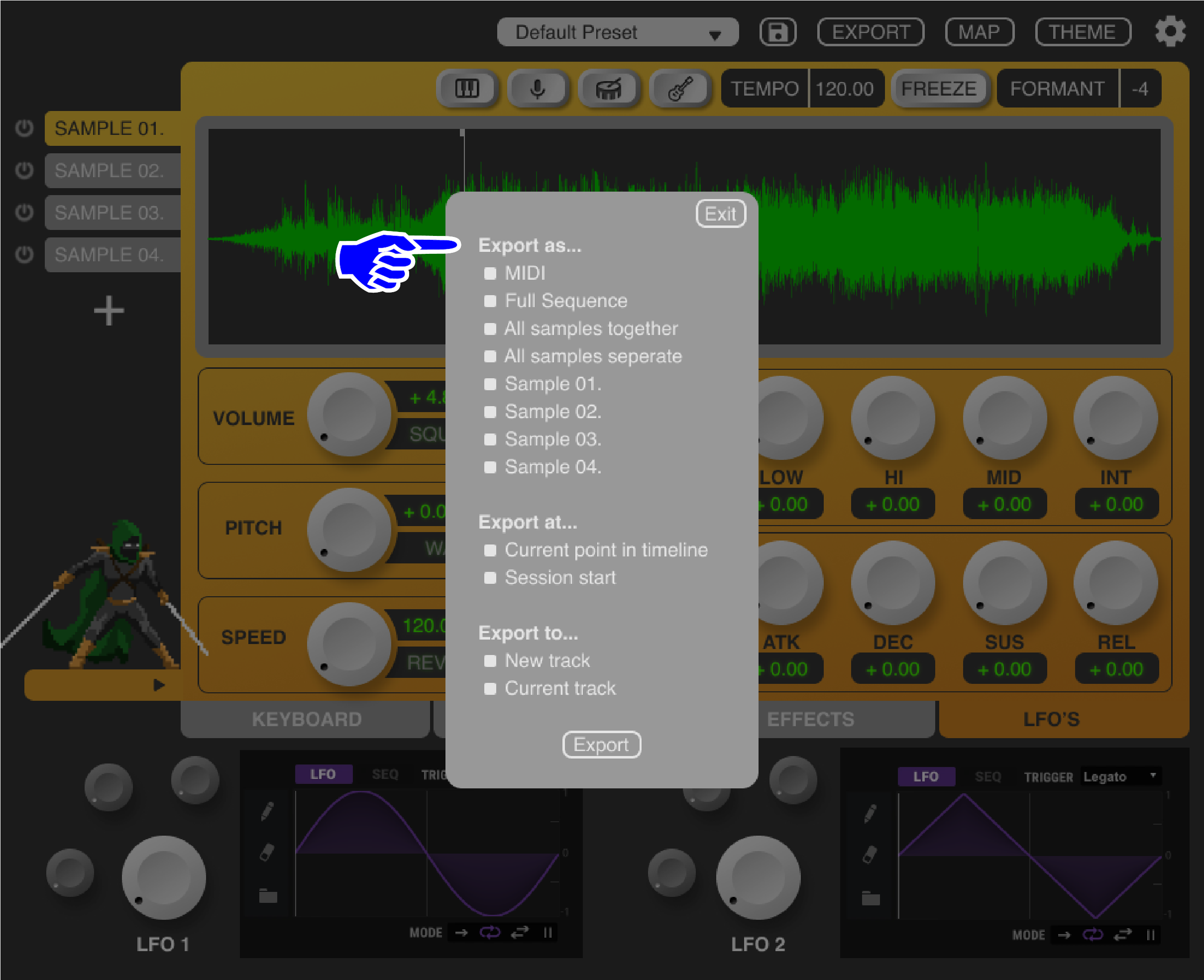
The “Export as” section gives users control over what type of file they want to export.
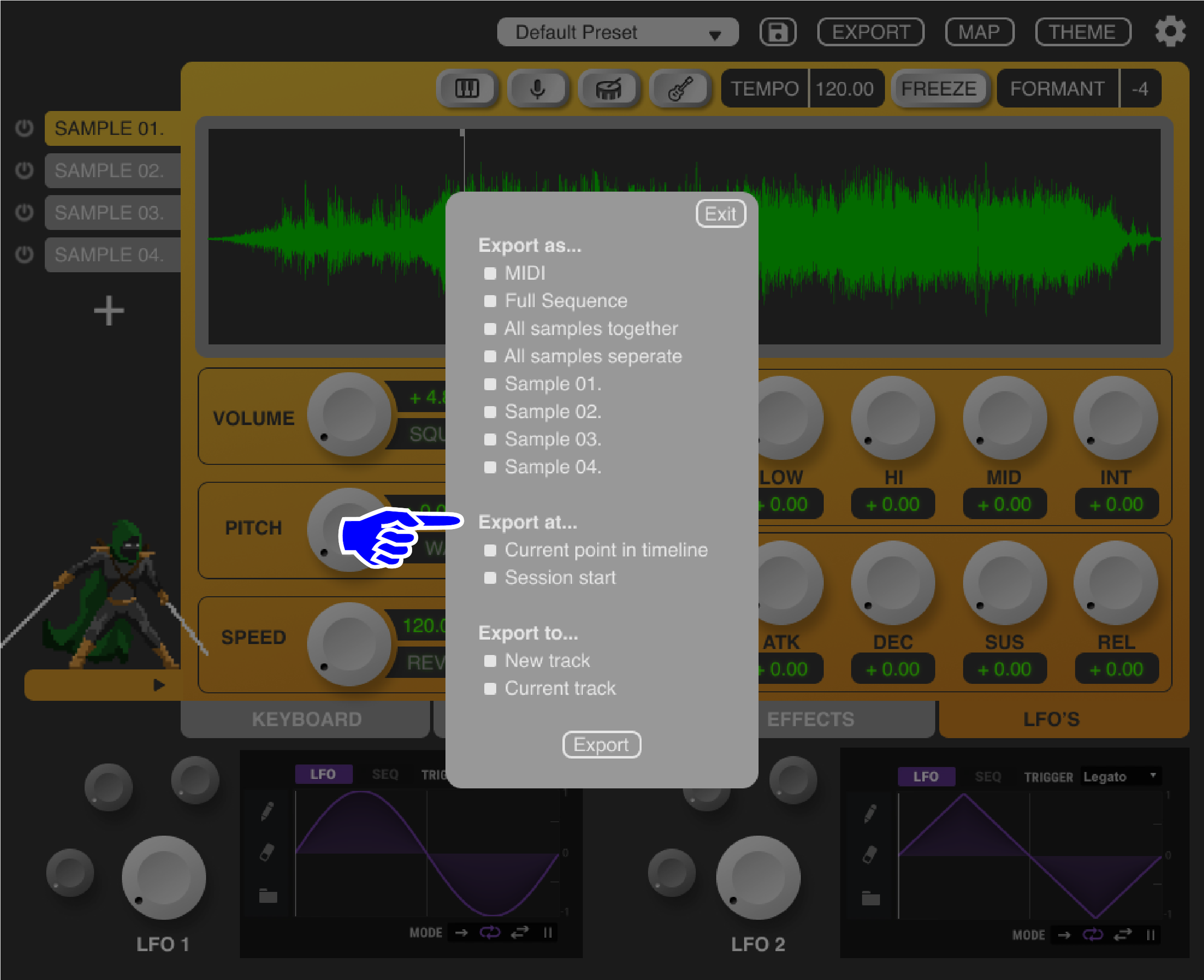
The “Export at” section gives users control over where in their DAW timeline the file should be created.
The “Export to” section gives users control over which track to create the file on.
PHASE TWO RESEARCH
Think-Aloud Protocol
Methodology
To evaluate my prototype I conducted four think-aloud interviews with users. Observing their behavior and recording their thoughts as they completed a series of pre-defined tasks using the prototype.
I asked them to perform typical functions they might do while sampling such as importing files, adding effects, and exporting audio back into their timeline. These interviews were conducted over Zoom.
I then took detailed notes on each interview, extracting key quotes and highlighting observations in user behavior. I once again put all these data points into FIgJam and organized them by type via affinity diagramming.
User Quotes
“Sometimes I won’t get a plugin because it looks ugly, if it looks ugly its like, oh maybe they didn’t put that much thought into it, but if it looks cool, it’s exciting and I’m more likely to download it.”
“I’m just not crazy about the colors.”
“It looks really nice and really clean, simplistic.”
“The way everything’s layed out is very nice, it’s not intimidating at all.”
“It’s got a good level of simplicity but it still has a lot of functionality.”
“The ‘+’ button doesn’t look very ‘button-y’”
“I like the finder window integration”
“For effects it would be nice to add effects to each individual sample, it feels like I’m adding effects to everything.”
Findings
Users will completely avoid/write off a plugin that doesn’t appeal to them visually, assuming if the aesthetics are bad, everything else will be bad.
The relationship between the effects panel and which sample is being affected is unclear, confusing all four participants.
Users generally like the aesthetic of the plugin but have mixed opinions on the colors.
Users appreciate the balance level between complexity and simplicity.
Users greatly appreciate the elements of the design that focus on sparking creativity, especially the AI isolator.
Users very easily intuit the AI isolator buttons, even without labels.
Users greatly appreciate that the plugin integrates with their own sample library rather than having one within the plugin.
Key Takeaways: Phase Two
User Pain Points
From my evaluative research, I selected the following pain points to address during my next design iteration
Users want more features designated to spark creativity
Users have conflicting views about the color scheme
Users are confused by the relationship between the effects panel and the multi-sample functionality
Users find the export window difficult to read/intuit
PHASE TWO PROTOTYPE
Phase Two Prototype Annotations
Click through the images below to read the highlights and rationale behind my phase two redesigns!

The name “Sample Warrior” is added

A drop shadow is added to the “+” button to afford pressing
The character in the bottom left is labeled “warrior” developing a consistent brand and recognizable mascot/logo
A drop down menu is added to the effects panel indicating which sample is currently being affected

Colors are made more consistent in the dials, background, and effects tab
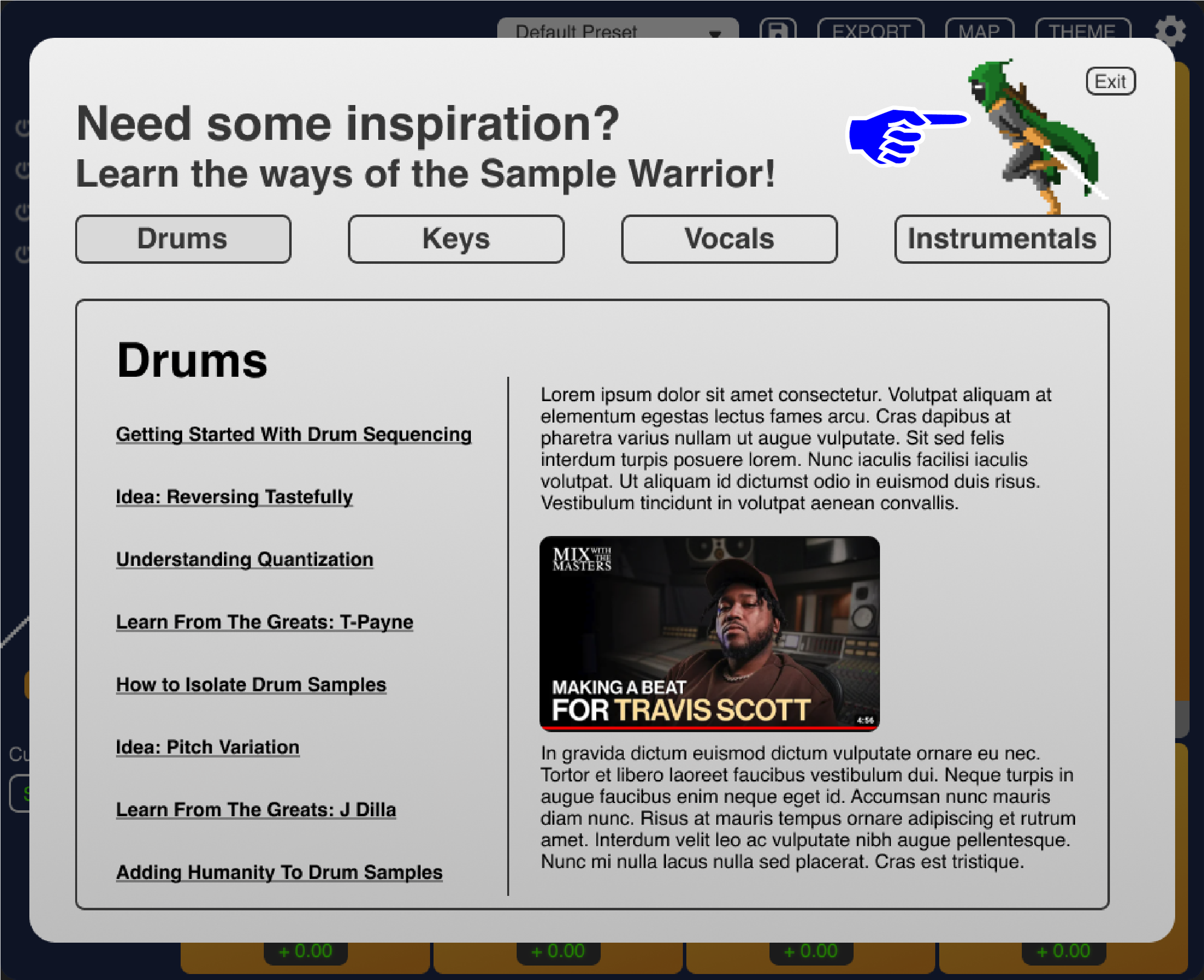
A new pop up is opened when clicking on the “warrior” character at the bottom left of the screen, It is a hub for resources designed to give users new ideas and foster creativity
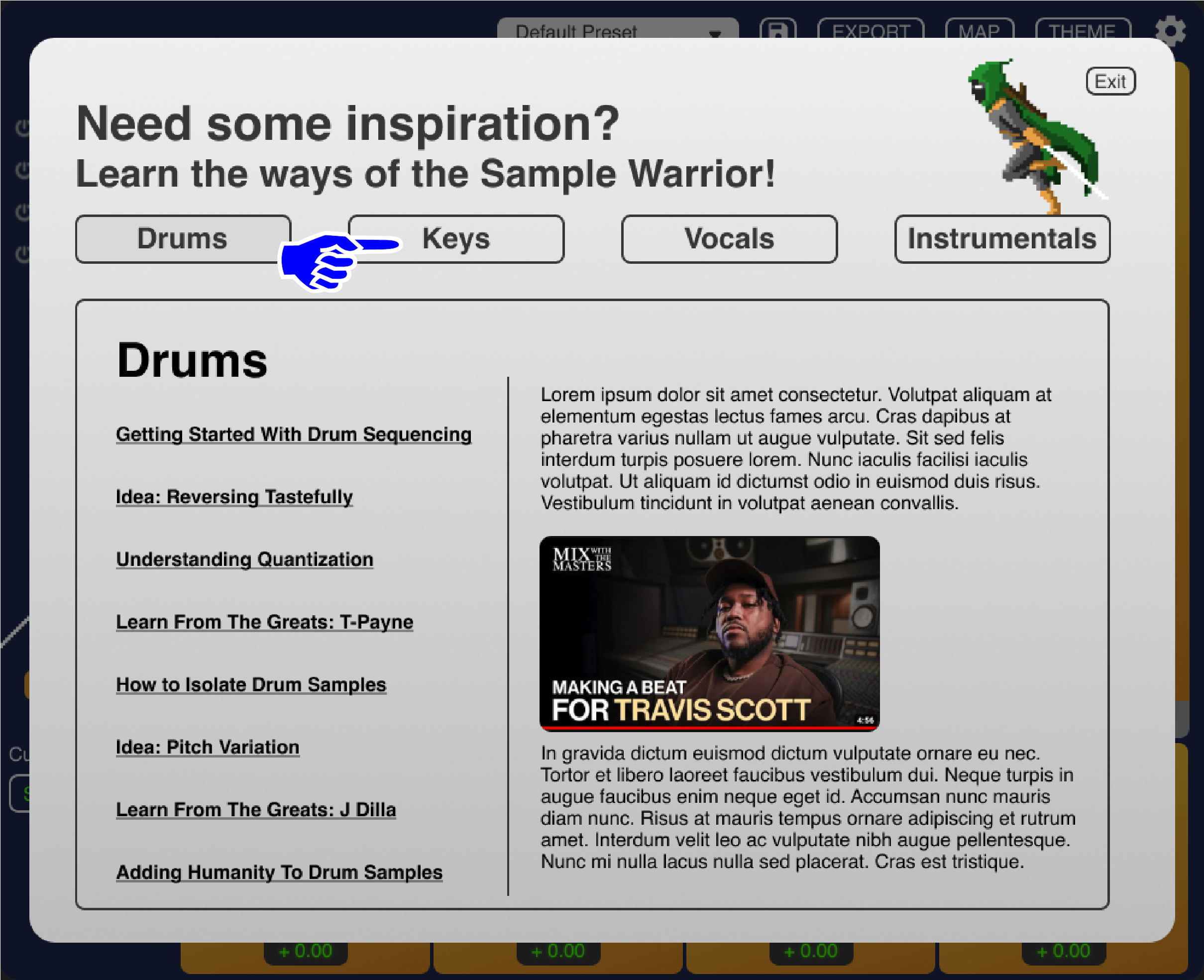
Tabs at the top sort resources by category depending on what the user is interested in exploring/learning about
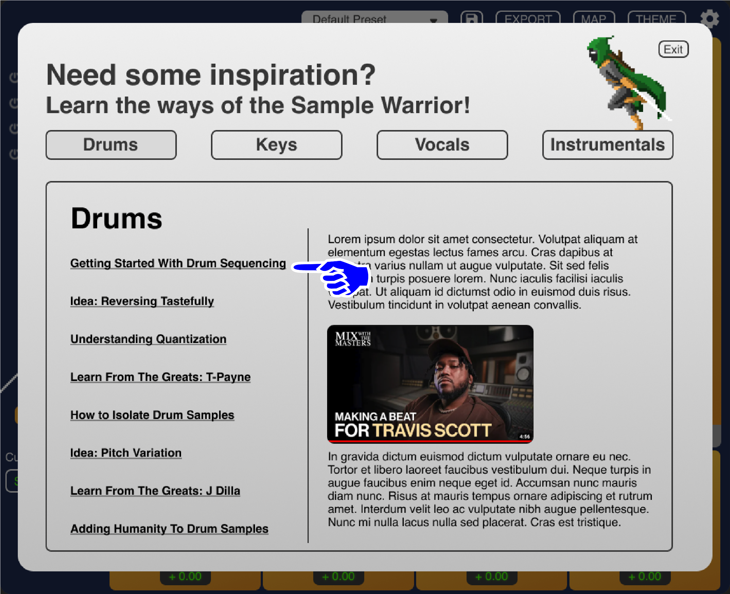
Articles/links are displayed on the left under the catagory title
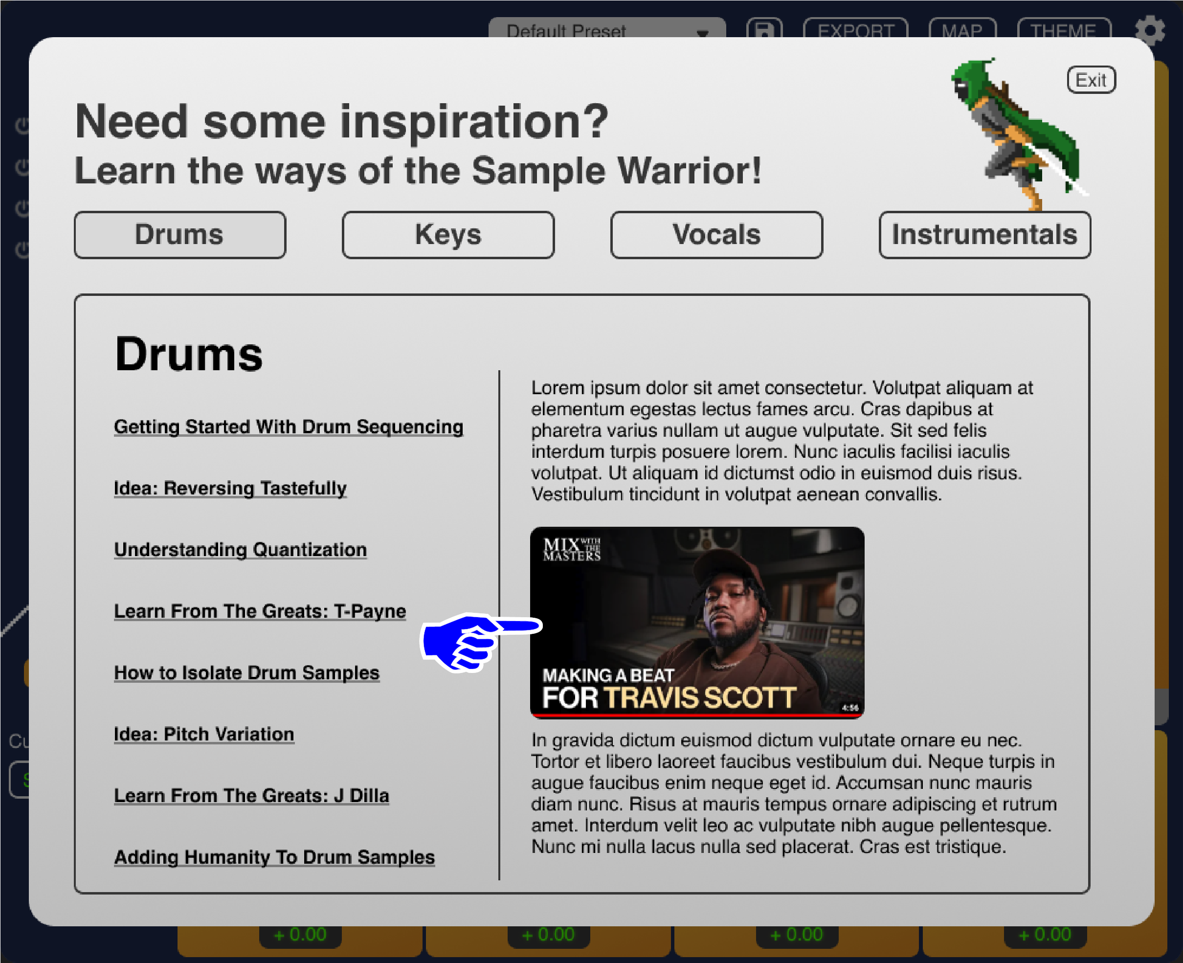
Videos and other external media files are linked directly within the articles

Export options are indented to more clearly show which category they are under
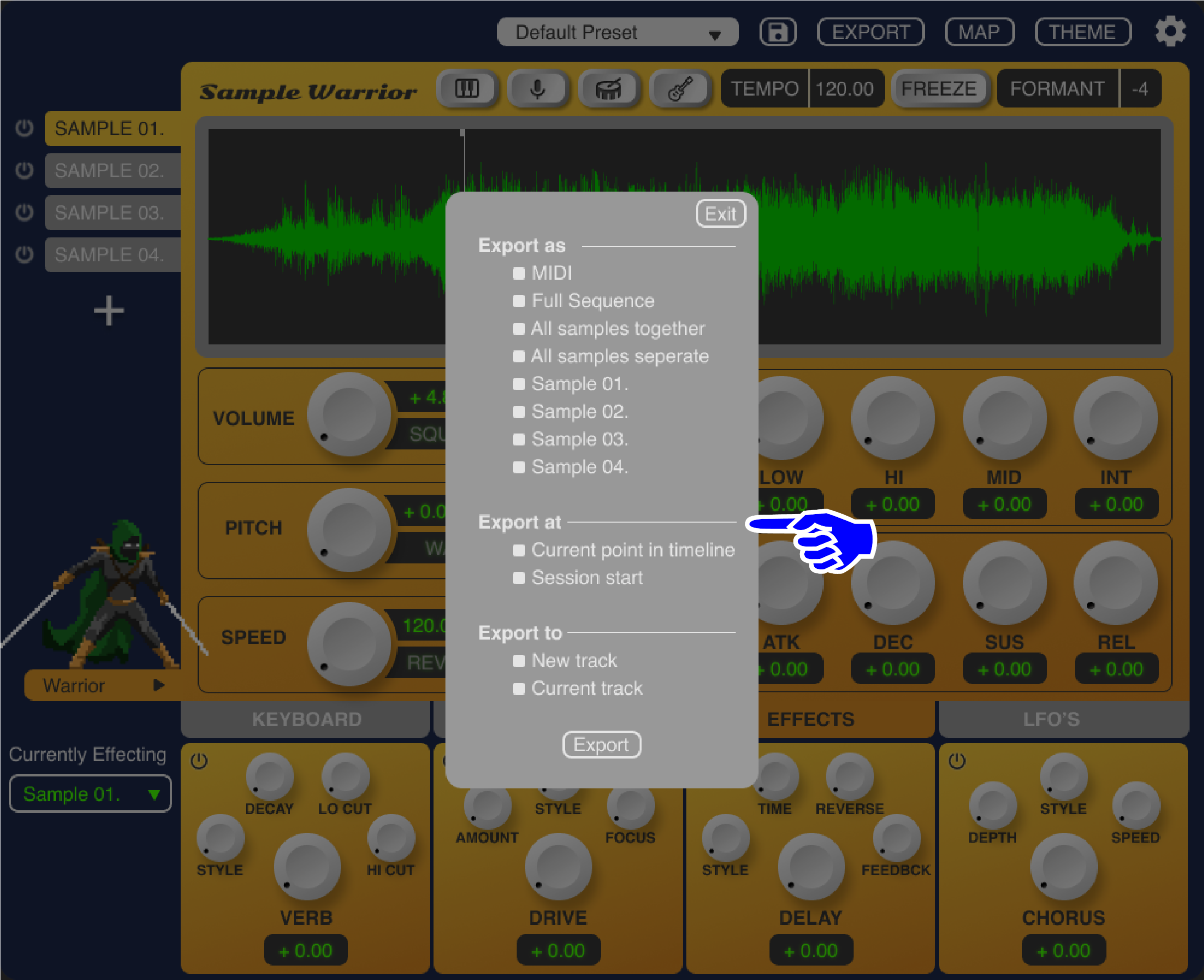
Lines are added to section headers to make sections more obvious
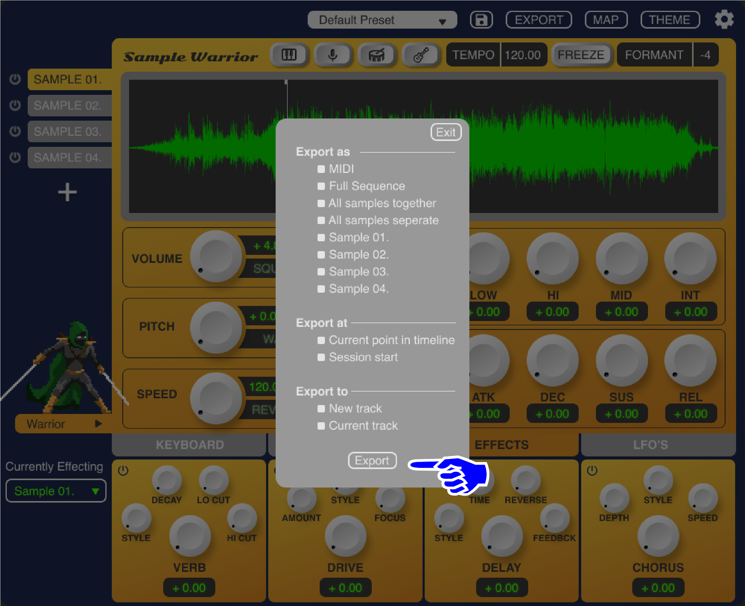
The export button is only pressable once one selection from each category has been filled giving the user feedback and ensuring they fully grasp the export process

The “theme” button is now interactive, opening a pop-up window with four unique colorways, this gives users control over their aesthetic experience and solves disagreement among users in regards to the color scheme
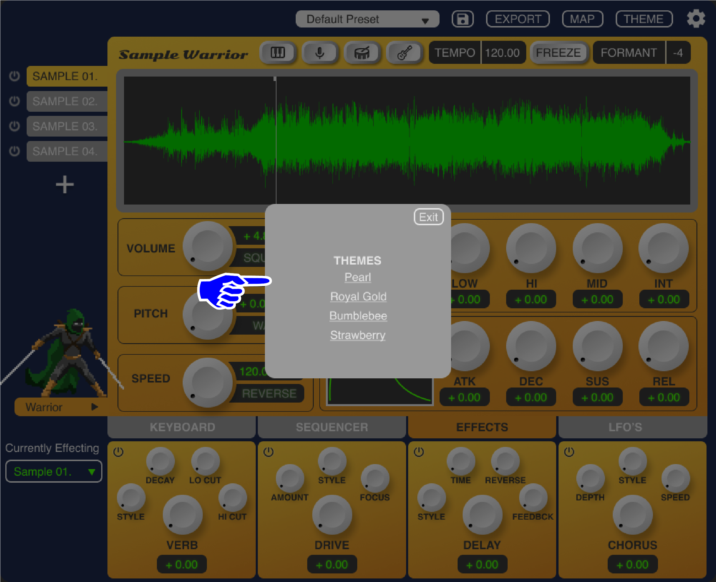
Users can easily switch between colorways via this pop-up
Adding Interactivity
Whilst the deep audio functionality of this prototype wasn’t part of the projects scope, the visual feedback users would experience was! In order to allow users to navigate the plugin as intuitively and realistically as possible, I made sure all the buttons, dials and navigation were interactive and functional.
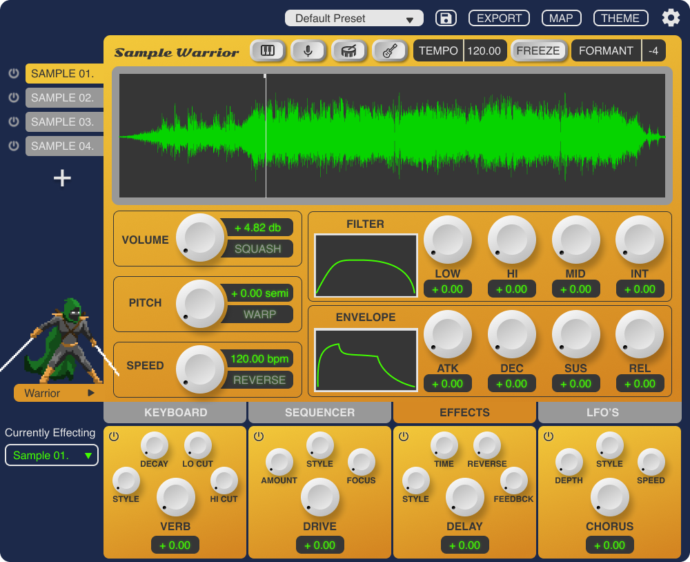
Adding Colorways
In response to conflicting user feedback around colors, I added four colorways to my prototype, giving users more flexibility over their experience and ensuring that the critical role that aesthetics play in their enjoyment of plugins would be satisfied.
Bumblebee
Bold and energetic, the Bumble Bee colorway features a vibrant yellow background that captures the warmth and vibrancy of a sunny day. Black elements and white knobs contrast sharply against the bright backdrop, creating a striking and dynamic visual effect that commands attention.

Pearl
A sophisticated and elegant option, the Pearl colorway features a dark grey background reminiscent of a smooth pearl surface. Silvery-white elements and white knobs add a touch of refinement and luxury, creating a sleek and minimalist aesthetic that exudes professionalism.
Strawberry
Sweet and charming, the Strawberry colorway offers a soft and delicate palette with a faint pink background reminiscent of strawberry lemonade. Cotton candy pink elements and white knobs add a playful and whimsical touch, creating a warm and inviting atmosphere that inspires creativity.
Royal Gold
Regal and opulent, the Royal Gold colorway showcases a deep navy blue background reminiscent of a starry night sky. Honey-gold elements and milky white knobs evoke a sense of grandeur and richness, adding a touch of sophistication to the plugin's interface.
Next Steps
Where to next?
There are many things I’d like to do with this project going forward. Here are some of the most immediate next steps as well as more long-term goals.
Refine design elements including finding a new font, experimenting with making font size smaller, or changing capitalization to increase open space on the interface.
Create new colorways and conduct user research on which ones are the most popular
Create a concrete style guide so I can prototype more plugins in the same style to make an entire line of products.
Further develop the branding around the product including promotional materials such as graphics that include the warrior character and a more simple, recognizable logo.
Refine the prototype’s interactivity, ensuring a wide variety of possible use cases are accounted for and removing any potential bugs in the user flow
Collaborate with developers to evaluate the logistics of more advanced features like the AI isolator and direct-to-timeline exporting
What I Learned
Takeaways from this project
Here’s a few highlights from the many things I learned while working on this project!
The iterative process of research, synthesis and design is crucial to UX. It’s important to continually iterate and not go too far as a designer before getting user feedback.
Slowing down and staying organized in Figma will save you time in the long run. Making sure you create components correctly and keep a clean work menu will make style guides and simple changes much easier down the road.
I learned a lot about Figma in general. This was my biggest undertaking on the platform so far and I feel very proud of what I was able to accomplish visually. I created most of my components from scratch, learning some basic design techniques for skeuomorphic elements and much more.
This project taught me a lot about time management and the importance of planning ahead.